Warning: Undefined array key "sharing_networks_networks_sorting" in /var/www/wp-content/plugins/monarch/monarch.php on line 3904
Warning: Trying to access array offset on value of type null in /var/www/wp-content/plugins/monarch/monarch.php on line 3904
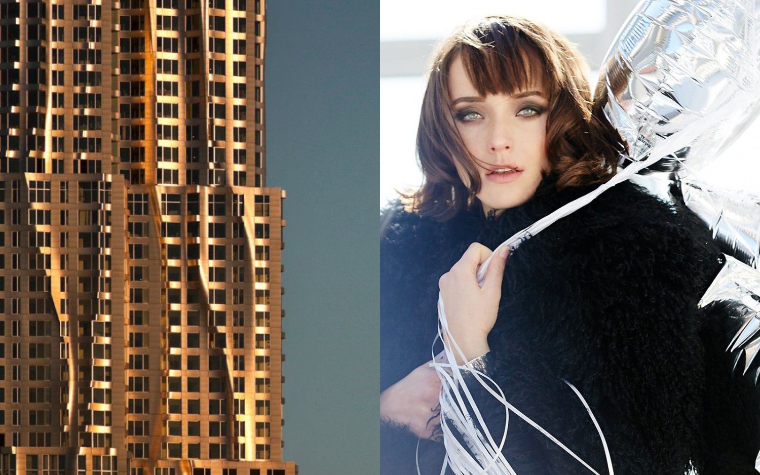
The 76-story, 899-unit luxury rental residential tower, “New York By Gehry” at 8 Spruce Street, in Lower Manhattan has unveiled a brand new website design to showcase its apartments and amenities.
The iconic Frank Gehry-designed structure features apartments and studios ranging from three-bedrooms and three penthouses. The new website is designed by IF STUDIO’s, Toshi Ide, and commemorates the tower, exposing its unique qualities. The images showcase the structure’s famous curving stainless-steel outward appearance as well as portray its stunning views of the advancing Financial District neighborhood.
The FiDi area, now a NYC hot spot for culture, dining, entertainment and family-friendly events, has grown into becoming the new downtown. With Brookfield Place showcasing high end venders and delicious eateries, Conde Nast moving into the One World Trade Center, and the impending shop-filled Fulton Street subway station, IF STUDIO’s photos of 8 Spruce Street support this rising downtown culture.
“When we opened the building, Frank Gehry’s striking design made it an instant architectural icon. Now it’s come into its own as one of the city’s signature residential experiences—a living “vertical city” with thousands of residents embracing all that FiDi has to offer. We wanted our website to capture that feeling and that style,” said Scott Walsh, Vice President of Residential Development at Forest City Ratner Companies. “We encourage anyone curious about life at 8 Spruce Street to visit the new website.”
Two photo shoots took place by two different photographers to capture the building’s look and feel. A building and neighborhood lifestyle shoot had photographer, Marley Kate, behind the lens along with an interiors shoot by Conde Nast travel photographer, Julien Capmeil. Lighting was important in both photo shoots to express how light changes throughout the day in the apartments. To show what morning and dusk are like inside, photographers moved throughout the apartments to get their model and interior shots of the spaces. The conscious decision to move throughout the apartments was made to show what it would be like for residents to live in the apartments and to feel the dramatic difference between daylight, evening and nighttime. For the panoramic shots, wider lenses were used to get a sense of latitude and longer lenses used for view shots to exhibit the city’s skyline.
To visit the new site click here.
-by Kelsey Maloney

