Warning: Undefined array key "sharing_networks_networks_sorting" in /var/www/wp-content/plugins/monarch/monarch.php on line 3904
Warning: Trying to access array offset on value of type null in /var/www/wp-content/plugins/monarch/monarch.php on line 3904
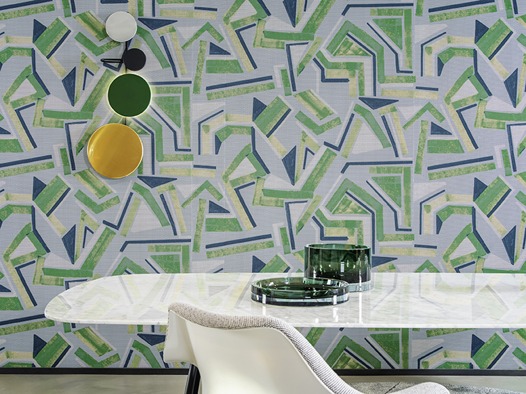
Arte International, a designer and manufacturer of luxury wallcoverings since 1981, has an in-house team of cutting-edge designers that create several new collections each year. The Belgium-based company has designs that adorn the walls of residential and commercial projects around the world, with permanent showrooms in Paris, Culemborg, and London. While we are continually impressed with the level of sophistication, color palettes, and attention to detail exhibited in each collection, their newest collection launch, Vanguard, stopped us in our tracks. We were so taken with Vanguard that we discussed it with both Bill Calhoun, President of Arte US, and Frederik Decoopman, Art Director of Arte, NV. The results speak for themselves.
Downtown: What inspired Arte’s newest wallcovering collection, Vanguard?
Frederik Decoopman: Abstract art from the 1950s and 60s and the Italian design of the period—especially that of Gio Ponti, a playful modernist and the father of modern Italian design.
Downtown: What drew you to abstract art from the 1950s and 60s?
FD: The middle of the 20th century was a brilliant era for art, architecture, design, and style. Abstract graphic patterns combined with playful and expressive colors brings something very special to the walls.
Downtown: What about Italian art in particular most drew you, and how would you say it translated into your new collection?
FD: The interiors imagined by great Italian designers and artists remain incredibly modern, sophisticated, and creative. We tried to transcribe these dazzling contrasts of colors, exuberant shapes, and fine craftsmanship into this collection.
Downtown: How many patterns and colorways make up the collection? What are the wallcoverings made of?
FD: The collection has two plain variants and four patterned variants.
The two plain references— a horizontal and a vertical plissé—showcase a running motif that recalls folded paper.
“Plex” is the timeless variant from the collection. This contemporary, matte version is a non-woven wallcovering that has been irregularly creased with a pleat running vertically. The pleats are completely random and vary in intensity.
“Mira” is a finely pleated non-woven with the compact folds running horizontally. It looks like waves. The ‘crest of the wave’ is given a layer of shine using metal foil, resulting in a refined look.
The “Plex” and “Mira” colour palettes contain several calming, fairly neutral tints, but they also include some of the brand-new trend colours.

“Modernist” consists of strips of stacked geometric shapes in contrasting colors, appearing almost as if patterns have been cut up and shifted around. It is finished with a thin layer of lacquer, which gives the entire surface a subtle gloss.
“Tessella” has a rhythmic tiled pattern with a combination of matte and metallic inks printed on the plain variant, Plex.
“Traverse” creates an intriguing play of vertical lines subtly interrupted by the vertical pleats of the plain variant, Plex. An accent layer of glossy metallic ink provides the ‘special effect’ in gold or silver.
“Expressionist”, printed on a high-tech mesh textile, invokes the notion of a modern painting and stimulates all the senses.
Downtown: If you could choose any of the patterns in one colorway, which would it be and where would you apply it?
FD: The real eye-catching design of the collection is undoubtedly the “expressionist”, a bold and beautiful modern painting-inspired pattern printed on a unique and experimental mesh material. These bright orange geometric shapes on a dark background will definitely make a statement.

Downtown: We are absolutely blown away by Expressionist in all its colorways. It’s surprising how different it can look (and how tactile). What do you find special about this pattern in particular?
FD: The relief, the texture, the flexibility of the fabric—it is an unconventional high-tech material in an explosive colour palette that features daring combinations. It’s clearly for the bold! Modern meets homage.
Downtown: Mira appears to have a lot of depth. Where do you see this wallcovering working exceptionally well?
FD: The depth is brought by the pleating obviously, and especially by this metal foil which highlights the relief. This luxurious and subtle shine plays with light. The strength of this reference is that it can fit just about any space, from a bedroom in neutral and relaxing tones to the walls of a bar or a restaurant in a trendy and daring colorway.

Downtown: Tessella seems to highlight imperfection in quite a beautiful manner. What was the goal with this particular pattern?
FD: Tessella invokes Greek and Roman Antiquity, where varied coloured blocks of glass, stone, or marble were pieced together to create a mosaic figure.
The whole thing is an optical challenge! Here you see depth, there relief…the pattern plays with the irregularity of the pleat which constitutes its base and magnifies it.
Downtown: What can we expect from your next collection? Does Arte have any interest in exploring and finding inspiration in the art from other decades for a subsequent collection?
FD: As everyone knows, the history of design and fashion is in eternal renewal. To be inspired by the treasures of the past and reinterpret them in our own way, to get that contemporary and trendy look, all of that is very exciting to us.
Downtown: Where can our readers find your wallcoverings?
FD: The best source for reviewing the Arte offering is www.arte-international.com From the site resources, resellers, showrooms, and sales agents info is available. Or, simply contact us at 866-943-2783 or email [email protected].


